Manipulating Reality: The Power of Numbers and Figures
Let’s start this article by answering a simple question. What is the coastline of the United Kingdom? Let’s search for it.
Let’s start this article by answering a simple question. What is the coastline of the United Kingdom? Let’s search for it.
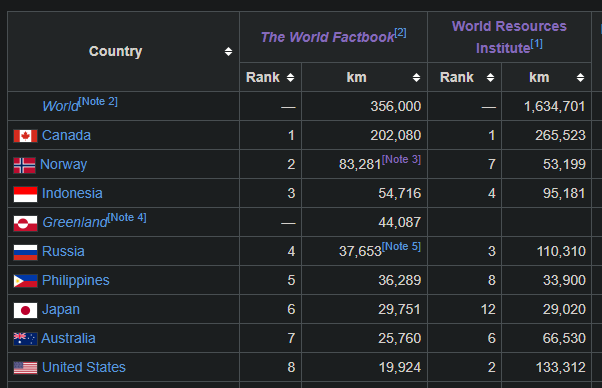
Seems like it’s 12,429km as per CIA Factbook, but as per World Resources Institute, it’s 19,717km. Two reputable institutes and widely different answers, that’s absurd. Did one of them screw up this measurement?
The answer is no. The results persist for all the countries around the world. And it’s not just numbers, even the rankings are different for each country.
As to what’s going on here is known as Coastline Paradox. The short answer to why the two measurements are different is, it depends on what stroke length has been considered while making these measurements. The below example shows a simple example.

If we zoom in further, you can get even longer coastlines. Further, the precision of the measurement instrument is also going to change the readings, in extreme cases, even to the level of atoms. That might be the topic of another article.
Further to this, the coastline is going to be even ever-changing, due to tides, it’s going to be shortened during the high tide and more during low tide, due to increasing sea levels, coastlines will continue shrinking with time. If someone decides to build a shipping port, it’s going to be further affected.
Now that the coastline paradox is understood, the concept can be extrapolated to any kind of analog measurement. Especially in cases where the borders themselves are changing. Here is another example; Where does the atmosphere end and space begin?; What is the diameter of the sun?
Why it matters?
12000km or 20000km, why does it even matter? 12000km or 20000km make a huge difference when visualizing the size of the nation does affecting the geographical policies made for them. Imagine, a navy commander going to a meeting for war planning. The task is to form a blockade for the coast with one ship sanctioned per 10km. If the number in front of him is 12000km, he will need 1200 ship, whereas if the number in front of him is 20000km, he will need 2000 ship. These numbers will cause him to overestimate or underestimate the strength of the enemy.
Similarly, based on where “the space” starts, the number of people who can be called astronauts will vary.
Below are few more instances where numbers and figures can vary our perseptions
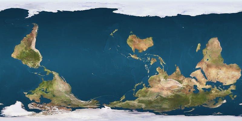
Size of Greenland
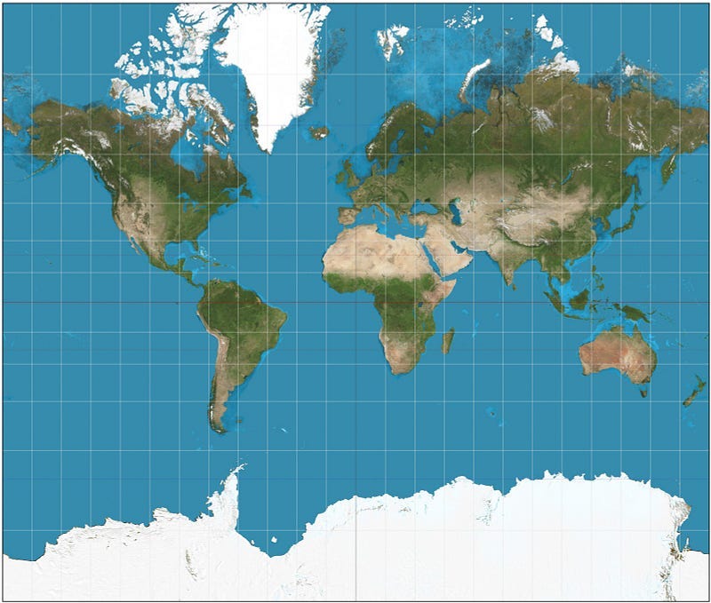
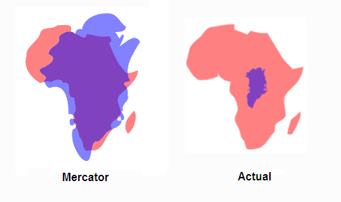
Here is another example of a similar fashion. Since we are so accustomed to seeing a flat map, which is a Mercator projection of the globe. We often overestimate the size of countries near the pole. Take Greenland for example in the below images. In the first image, it looks almost as big as Africa, but look at the second image or true comparison.
North can be down
There are also, psychological biases that affect decisions. In the map, North is generally up even though there is no reason for it to be and it’s arbitrary. We are accustomed to correlating up, more or top with good and down, bottom as bad (similar to heaven and hell). So, even though there is no reason for the North to be on “up” in the map, we might subconsciously correlate Northern countries as superior.

Also, USA and Russia are geographically much more closer than we visualize (Specially with Alaska).

It’s very easy to lie or make false perceptions with number, images, and graphs if we are unaware of assumptions. Even if the details are not false, a skilled storyteller, can use the same number and make you believe in anything.
Manipulation with data
Here is a humorous example, Do you know 40% of marriages in US end up in divorce? The problem is, it’s even worse for the remaining 60%, they end up in death.
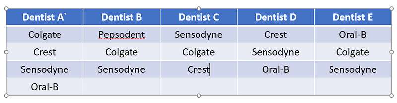
Toothpaste Advertisement
Another misleading example is of toothpaste companies with claims like 80% of the dentist recommend Colgate. Yes, it’s true but look at the image below. Based on the data, I can make any statement like 80% of Dentist recommend colgate. 100% of the dentist recommend Sensodyne, 60% dentist recommend Crest or Oral-B and they’d all be correct. (FYI, the advertisement was finally banned in 2007 in UK)
Extrapolating Prices
In a personal incident, a salesperson was trying to sell an electricity plan. She took my daily usage and extrapolated it to monthly usage. She then calculated the rate as per both my current provider and her plan to calculate the savings, then generously doubled the savings for usage in peak summer (August vs the current not-so-hot month of July) and then multiplied it by 24 to get savings for 2 years (because, you know, it’s peak summer 12 months a year). The final number, $2400 of savings was funnily around 70% of the amount I’d actually pay if I extrapolated the usage independently. And all of these savings was by an electricity rate difference of 3 cents per kW (13.9 cents per kW vs 16.8 cents per kW)
Minimize being manipulated
People have been using stats across marketing, geopolitics, news, engineering and everywhere to make all kind of perceptions. So, what can we do to minimize the manipulations?
Compare data from multiple sources
Check whether the data you’re referring to is consistent across multiple reputable organizations. Watch and read multiple news agencies to understand their biases.
Be aware of assumptions
Irrespective of whether the data is consistent or not, when presented with data, ask questions like baseline assumptions and methodology while gathering the data. In the coastline paradox, the questions could be How is the coastline defined? What is the measurement methodology of coastline lengths?
Compare similar sources of data
Single organization data is more likely to be consistent and follow a similar methodology.
Be Aware of data biases
Data collection systems have their own biases. These are affected by multiple factors, geopolitical, local extrapolation, news, personal beliefs etc. E.g. Psychological studies are more likely to be biased towards representing the demographic of young individuals in their 20s since that is the group of graduate students, far more easily available to university researchers.
Look at data from an alternate perspective
Beware of axis and scale while looking at a graph. Both of the below graphs show the same data but create far different perspective.


References and Credits
Wanna read more? Below are the sources of data presented in the article above for you to question and point out my assumptions and biases.
Coastline paradox - Wikipedia
The coastline paradox is the counterintuitive observation that the coastline of a landmass does not have a well-defined…en.wikipedia.org
This One Country Shows How Distorted Our Modern Map Is
Greenland and Africa aren't actually the size.www.businessinsider.com
Colgate's '80% of dentists recommend' claim under fire | marketinglaw
Colgate's '80% of dentists recommend' claim under fire, read now at Osborne Clarke's Marketing Law.marketinglaw.osborneclarke.com4.